The Bull Rock


Brief
Lighthouses of the World
Editorial Type Project
Client
International Society of Type Designers (ISTD)
Year
2022
Brief
The International Society of Type Designers annually holds an editorial design competition aimed at design students under the “Student Assessment Scheme.” Several different briefs are released each year, allowing students to select the topic they find most personally compelling. Contest winners are recognized with an invitation to membership in the society.
Of the many 2022 briefs, I chose to investigate “Lighthouses of the World.” Students who chose this brief were encouraged to conduct thorough research in order to create a book that explores lighthouses from a specific and exciting new angle. Naturally, I was immediately fixated on locating and documenting haunted Irish lighthouses.


Process
Immediately, I was drawn to the idea of haunted lighthouses. Ireland is home to some of the oldest lighthouses in the world, and its craggy coasts are home to 120 lighthouses. Surely there had to be a haunted lighthouse or two with a history for me to dredge up.
After much research, I settled on the Bull Rock Lighthouse, situated off the coast of the Beara Peninsula. Centuries of waves have carved the Bull Rock into a natural archway, and it is said to be the home of Donn, the ancient Celtic lord of the dead. Legend tells of departing souls passing through the archway on their way to the spiritual plane, otherwise known as the “Otherworld.”
After several iterations and dummy test prints, the project finally came together. My book is a collection of myths, legends, and personal accounts of the Bull Rock Lighthouse and its ancient surroundings.
The project was a crash course in InDesign and the importance of typography, grids, layouts, materials, and finding a good printer.


Solution
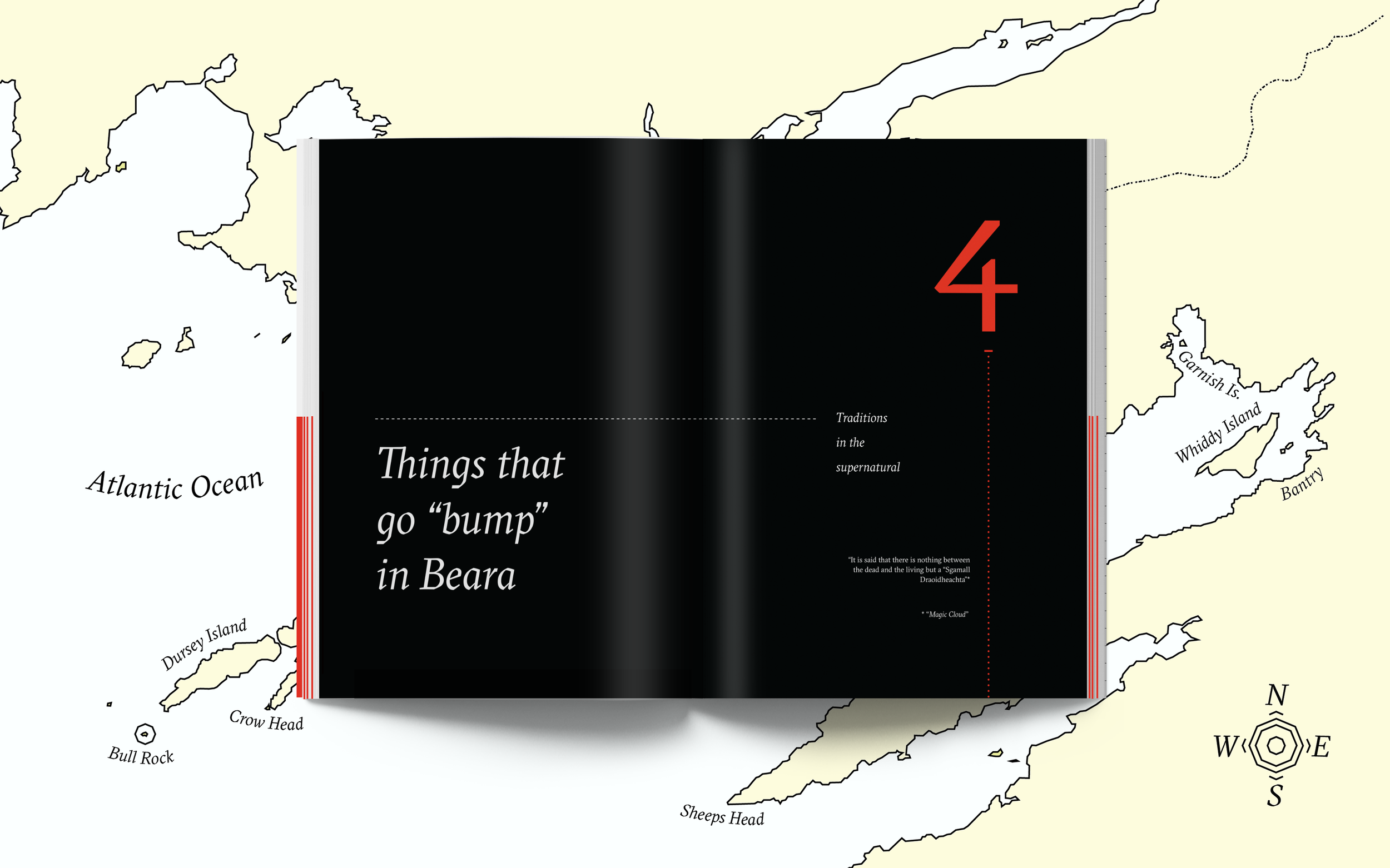
The final book is a compact A4 size with A5 inserts in bright red running throughout. It is the size of a handheld journal and was designed to look and feel like an adventurer’s travel diary, complete with a fold-out map in the back.
The A4 pages represent the primary and secondary sources that I found about the myths and legends of the Bull Rock, and the bright red A5 papers feature my running commentary in white. The insert color was inspired by the Bull Rock Lighthouse’s bright red railing, which plays a pivotal role in one of the book’s featured stories.

I chose the GT Sectra typeface because its chiseled, calligraphic angles evoke a traditional and rugged feel that is true to the voluminous history and rugged coastlines of the Beara Peninsula.
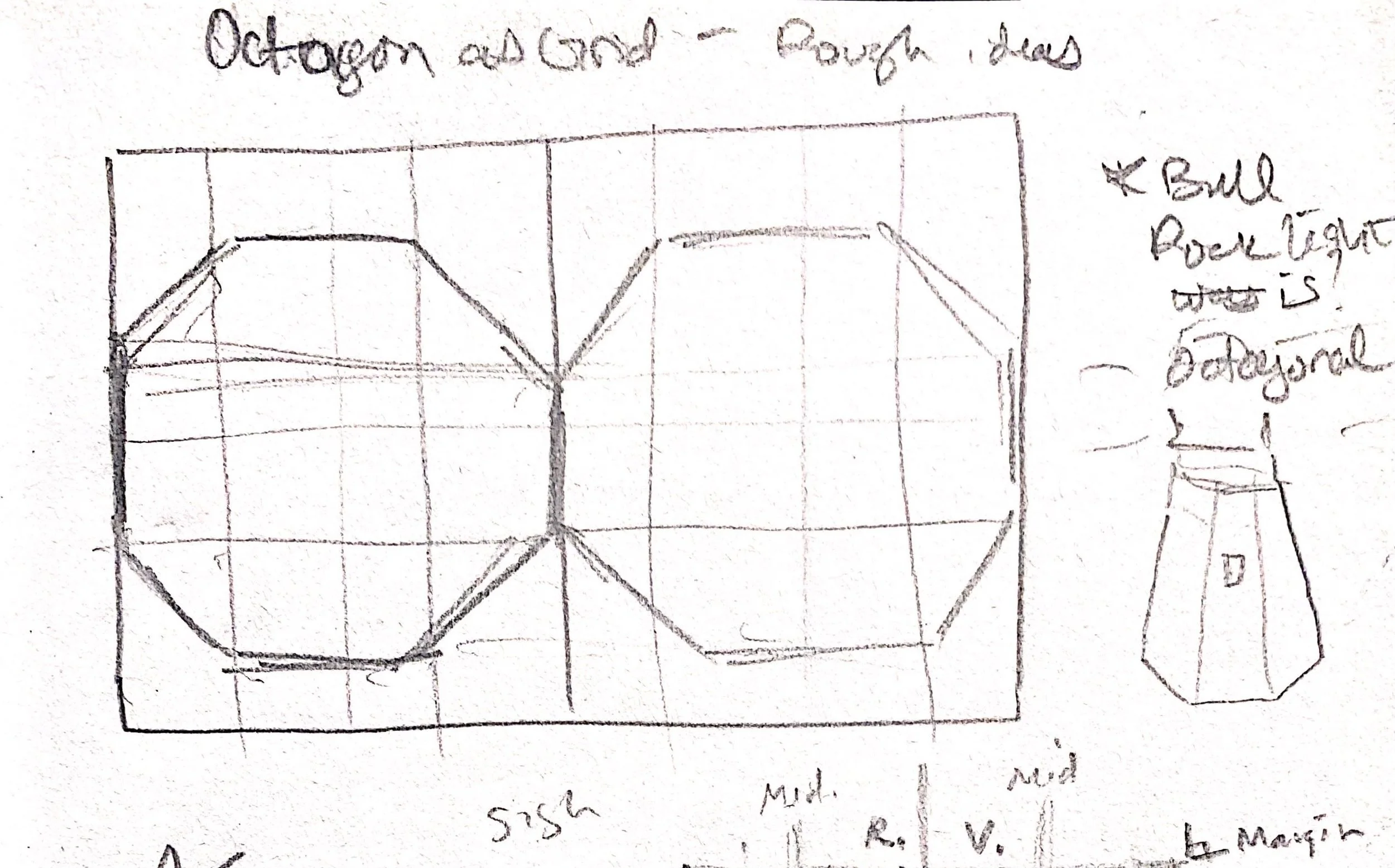
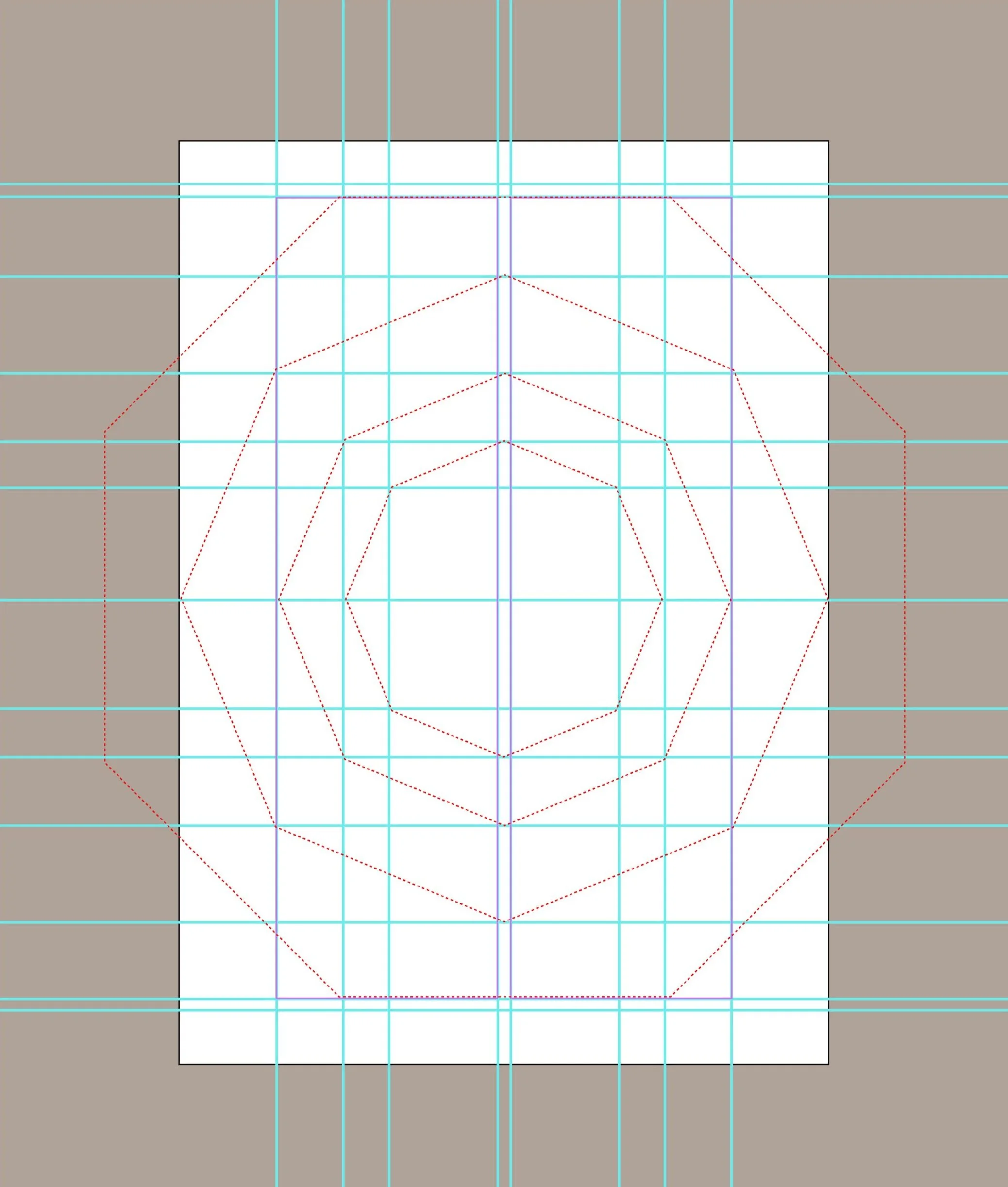
Dotted lines and concentric dotted octagons are used throughout as emphasis marks and page divisions, inspired by nautical maps and by the Bull Rock’s octagonal base.
I especially enjoyed creating the chapter break spreads, one of which can be seen overlaying the map illustration. A click-through online version of the book can be found here.