
Psycho
Reimagined


Year
2020
Client
DDI
Brief
Create a Movie Poster
for Superfans
Brief
For this brief, we were asked to create our own movie posters for a movie of our choice (from a pre-selected list, of course). As a horror movie fan, I immediately knew I would be designing a new look for Alfred Hitchcock’s 1960 classic film, “Psycho.”
We had to create both a reimagined movie poster for a specific target audience and a “cult” movie poster more geared towards superfans. For each movie poster, we had to first create a handmade version which we later had to re-create digitally. This page displays my reimagined movie poster and the process behind its creation.


Process
I decided to market “Psycho” to a more modern generation of viewers, specifically people at the older end of Gen Z and the younger end of Millennials. This is a generation that has an appreciation for both aesthetically beautiful, brightly colored motifs as well as the macabre. The poster had to be bold, colorful, and demanding of the younger generations’ distinctly short, not-so-easily impressed attention span.
I chose bright pink, blue, and yellow for my attention-grabbing color palate, and relied on lino cuts, ink and yellow paper to create the visuals. Overlays of Marion Crane, Norman Bates, and a human skull foreshadow some of the movie’s themes (Marion’s murder, dead mom in the basement, Norman dressing as his mom) and create a destabilized, gritty and anxiety-inducing series of illustrations.


Typography
A quick study of color psychology reveals that we often associate bright yellow with implied danger, fear, and anxiety. Perfect!
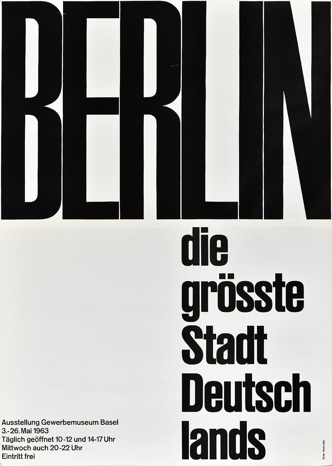
Equipped with yellow and red paper, I set to work on the design of my title typography, drawing inspiration from Swiss Design, specifically a couple works by Emil Ruder and Wim Crouwel.
The rest of the poster typography was inspired by paper cutout lettering by Saul Bass as a nod to the creator of the original movie credits.

Digitizing
The very first thing I did was scan in the old poster and isolate the car painting, which I touched up using digital paintbrushes in Photoshop. Next, I created my own textures and brushes in Photoshop by scanning in watercolor and lino ink marks that I made with brushes and sponges to create grassy, bog-like textures. The eerie yellow to black foggy gradient was achieved using the blend tool.
Check out the two finished posters below to compare the handmade and digital final pieces.

Handmade Original

Digital Recreation