
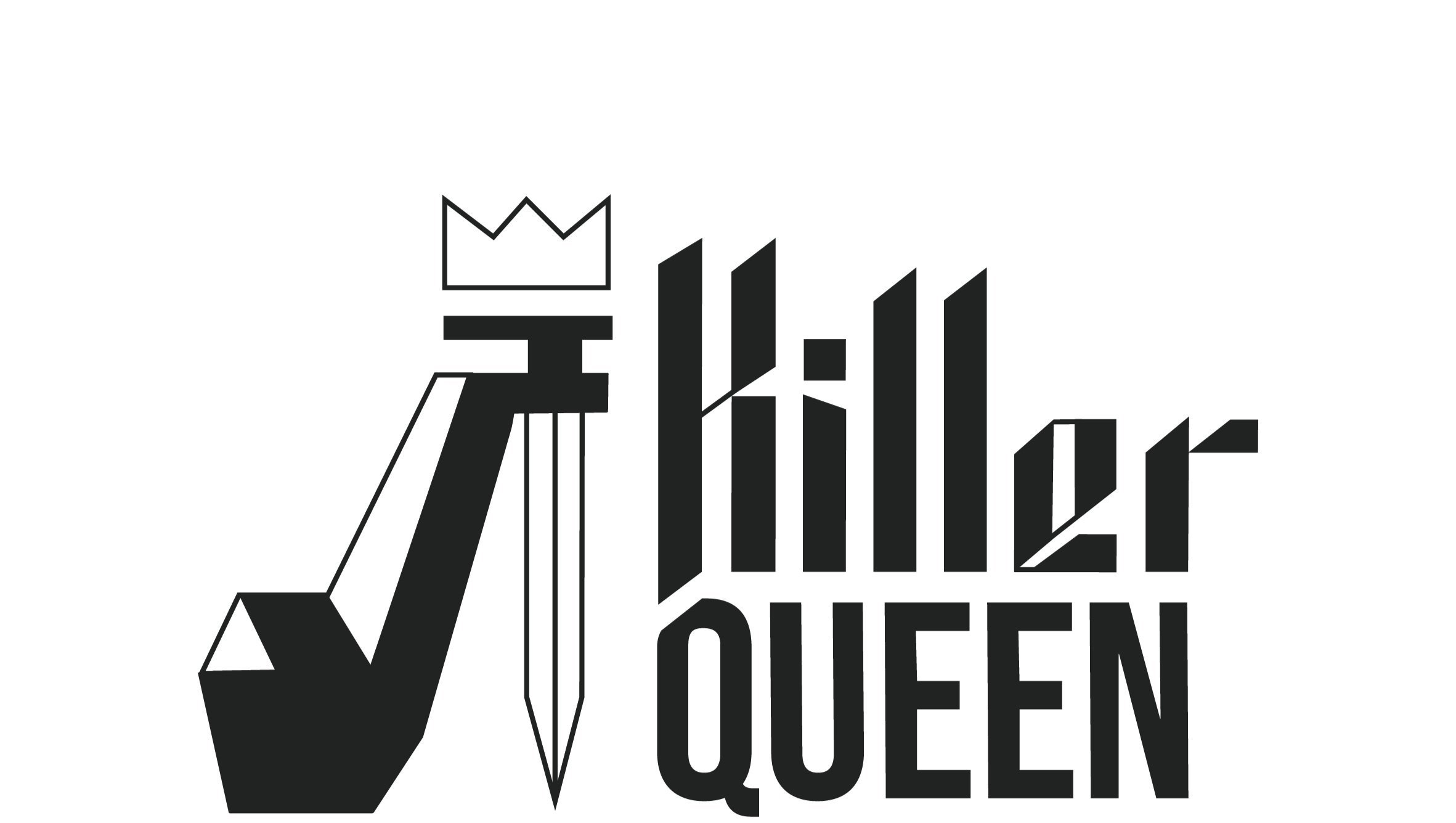
Killer
Queen


Year
2021
Client
Dublin Design Institute
Brief
Re-Brand Shakespeare’s “Macbeth” for a New Target Audience
Brief
The challenge for this brief was to re-brand a production of Shakespeare’s “Macbeth” and present it to a specific target audience. Knee-deep in COVID online school in my cold, North Dublin apartment, all I wanted, with every fiber of my being, was to have a good time.
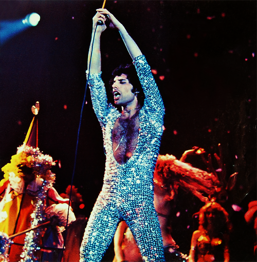
So, when I re-visited the plot of “Macbeth” and realized there was an angle to play up on Lady Macbeth as a “Killer Queen” for a Queen-themed piece of dark comedy musical theater,
I had no choice but to bring that idea to life.


Process
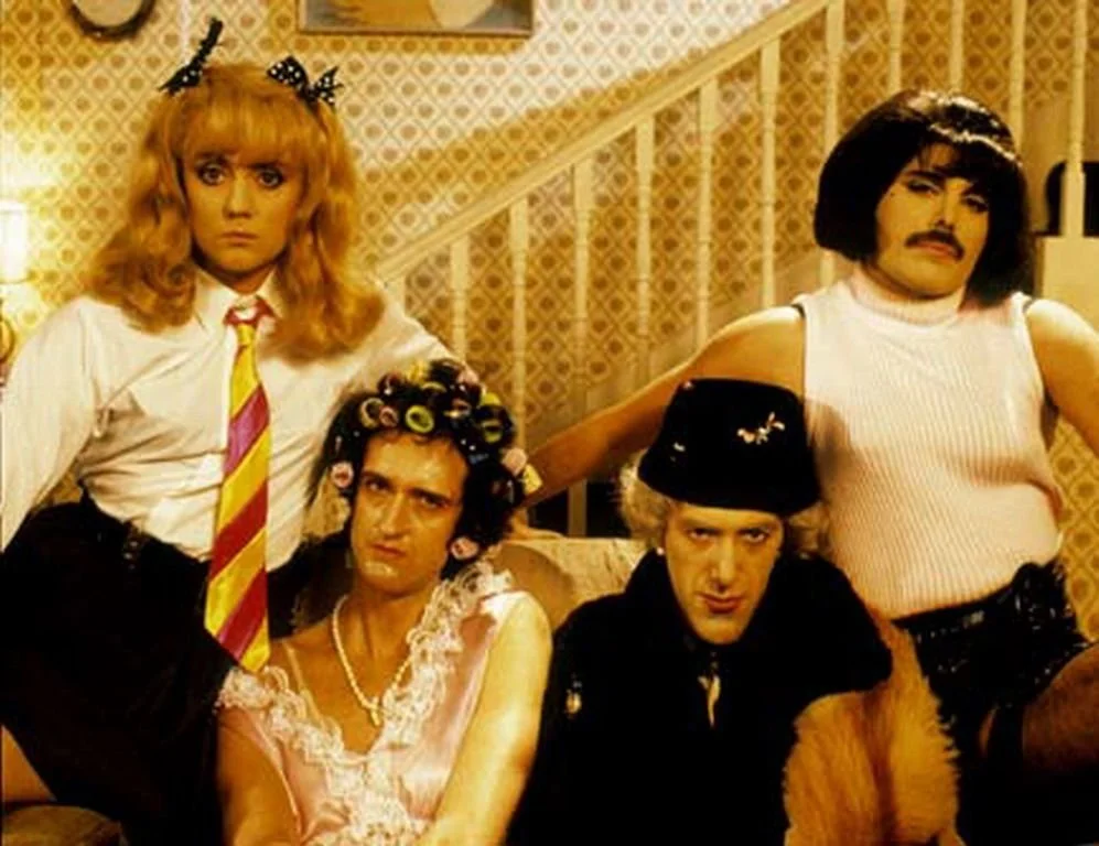
“Killer Queen” is marketed toward a younger audience, meant to appeal to cusper Gen Z/Millennials. Admittedly, around my own cohort. While I liked to think I inherently knew what the youths like, I did my due diligence and researched Spotify listening patterns, drag show programming, and color trends to see how I would pitch my revamped Shakespearean vision to a younger target audience.
I researched Queen, glam rock, and how current and how gender play and drag has evolved and shaped pop cultural icons over the past several decades.


Typography +
Logo
After much exploration, I decided on a look with minimalist, poppy, and illustrative visuals in blue, yellow, and pink. A slight shift from primary colors that is also attention-grabbing and referential to the gender play that is inherent to the production.
Ultimately I landed on the high heel/dagger iconography, which pays homage both to drag queens and to Lady Macbeth’s murder weapon of choice.
I used Bebas Neue for my display font and created my own illustrative typography for part of the logo.
I wanted something that referenced the medieval setting with the rock-and-roll edge. After several illustrative and typographic iterations, I went for a pointy calligraphic solution.


Poster
I was obsessed with using this opportunity to create a continuous poster design. The challenge of designing something that worked well as a standalone piece and also as a larger advertising display was an exciting one.
I drew some light inspiration from classic playing cards to create the simple and dynamic illustrations, where juxtaposed limbs frame some of the central themes of the show.


